How to Prepare Files for Print
From color profiles to the last crop mark — everything you need to know so your product is printed without errors, delays, or extra charges for corrections.
A properly prepared file means fewer corrections, faster printing, and a lower price. This guide covers file preparation for offset and digital printing, 5th color (Ricoh), and DTF textile printing. We have organized it into clear sections — from basics to advanced techniques. If you are unsure, send us your file — we review it for free.
Guide Navigation
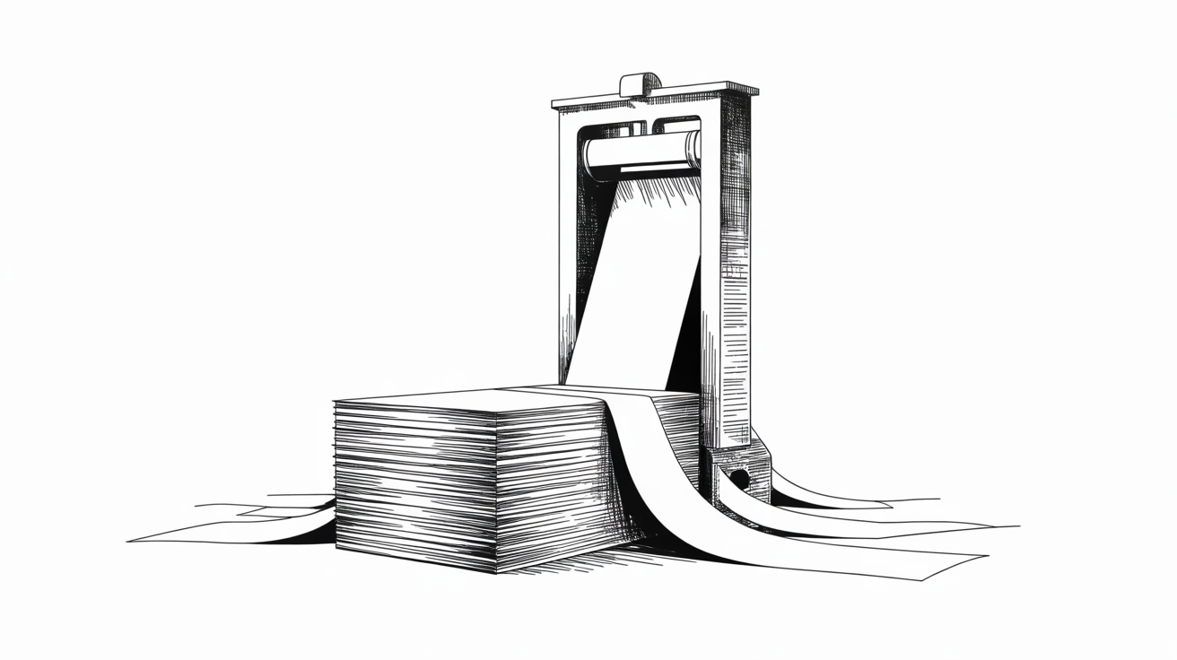
Bleed, Trim, and Safe Zone
Every printed product is cut to its final size after printing. The blade is not perfectly precise — typical deviation is 0.5–1 mm. That is why your file needs three distinct areas that work together to ensure a clean result with no white edges or trimmed-off text.
Diagram: three key areas in print file preparation. Red = bleed, black = trim line, green = safe zone.
Bleed — 3 mm
Bleed is a strip of color that extends 3 mm beyond the final trim edge on all four sides. Think of it as a safety margin: when the blade cuts the paper, it can shift by a fraction of a millimeter. Without bleed, an unprinted white strip would appear at the edge. With bleed, color is always present right to the very edge — regardless of where the cut lands.
The bleed must be a logical continuation of your design — not a stretched image or random color, but a natural extension of the background or pattern. If you have a photograph running to the edge, simply extend it 3 mm beyond the trim.
Crop Marks (Trim Marks)
Thin lines at the corners of the document that tell the print shop exactly where to cut. Without crop marks, the operator does not know where the final format begins and ends. All professional software (InDesign, Illustrator, Affinity Publisher) adds them automatically on PDF export — you just need to enable them in the export settings.
Crop marks must sit outside the bleed area — at least 3 mm from the trim edge. Most software handles this automatically.
Safe Zone — 5 mm
The inner area, 5 mm inward from the trim edge. All critical elements must stay within it: text, logos, QR codes, contact details. For bound products (books, brochures, catalogs), the safe zone along the spine is 10 mm, because the page curves at the binding and content near the spine is not fully visible.
A common mistake: text placed 2 mm from the edge. When cut, such text looks either trimmed off or uncomfortably close to the edge — even though it technically remains on the sheet.
Business card example: Final size 90 × 50 mm. File with 3 mm bleed: 96 × 56 mm. Safe zone for text: 5 mm from edge inward = effective text area of 80 × 40 mm. Not huge — which means the layout needs to be thoughtful.
Color Profiles, ICC, and Calibration

CMYK vs RGB — why it matters
Screens display colors by mixing light (RGB — red, green, blue). Printers create colors by mixing ink (CMYK — cyan, magenta, yellow, black). These are two fundamentally different physical processes with different color ranges. A vivid neon green that looks brilliant on screen simply does not exist in CMYK — it will print darker and more muted. This is not a print shop error; it is a physical limitation of pigments.
Therefore, always set your document to CMYK from the start — not at the end. If you design in RGB and convert only at export, you will only then discover that colors have shifted. If you set CMYK from the beginning, you design within the actual limitations and avoid surprises.
ICC Profiles — the language between device and print
An ICC profile is a file that precisely describes how a specific device (monitor, printer, press) reproduces colors. When you tell your software which ICC profile to use, you are effectively saying: “These CMYK values will look like this on this press, on this paper.”
Our preferred profile for standard printing: PSO Coated v3 (Fogra51). This is the latest European standard for printing on coated paper. It is based on press data from across Europe and replaces the older Fogra39. If your software offers Fogra51 — use it. If not, Fogra39 (ISO Coated v2) is still acceptable.
| Profile | Standard | Paper | Usage |
|---|---|---|---|
| PSO Coated v3 (Fogra51) | ISO 12647-2:2013 | Coated | Recommended |
| ISO Coated v2 (Fogra39) | ISO 12647-2:2004 | Coated | Acceptable |
| PSO Uncoated v3 (Fogra52) | ISO 12647-2:2013 | Uncoated | For uncoated paper |
| ISO Uncoated (Fogra29) | ISO 12647-2:2004 | Uncoated | Older, acceptable |
Monitor Calibration
Your monitor lies. A factory-calibrated display shows colors in a way that is pleasing to the eye — more saturated, brighter, higher contrast. For print, this means you will always perceive the printed result as “more washed out” than the screen, even when the print is perfectly color-accurate.
The solution is calibration with a colorimeter — a small device (e.g., X-Rite i1Display, Datacolor SpyderX) that you hang on your screen, run the software, and in 5 minutes you have an accurate screen profile. From that point on, the monitor shows colors as the printer will print them — not prettier, not worse.
If you do not have a colorimeter: at minimum, reduce screen brightness to 50–60% and disable any “vivid” or “HDR” modes. This is not calibration, but it is better than nothing.

Soft Proofing — simulating print on screen
Even with a calibrated monitor, it is useful to use soft proofing — a feature that simulates how the document will look when printed with a specific ICC profile on a specific paper. In InDesign: View → Proof Setup → Custom → select profile (Fogra51). In Affinity: Document → Soft Proof Adjustment Layer. In Photoshop: View → Proof Setup → Custom.
Soft proof shows you which colors fall outside the CMYK gamut — colors the printer cannot reproduce exactly as shown. Instead of a surprise after printing, you get the surprise on screen — where you can fix it.
PDF/X Standards
PDF/X is a subset of the PDF format specifically designed for reliable exchange of print files — it ensures that fonts are embedded, colors are correctly defined, resolution is adequate, and there are no hidden elements that could cause a printing error. The differences between versions come down to how much freedom they allow the designer and how strictly they validate the content.
| Standard | Transparency | ICC Profiles | Colors | Notes |
|---|---|---|---|---|
| PDF/X-1a | No | No (CMYK + spot) | CMYK + spot only | Strictest. Widest compatibility. |
| PDF/X-3 | No | Yes | CMYK + spot + ICC | Allows ICC profiles for late conversion. |
| PDF/X-4 | Yes | Yes | CMYK + spot + ICC + RGB | Recommended. Modern, flexible. |
Why we recommend PDF/X-4: It supports transparency (drop shadows, soft edges, opacity) without flattening, allows embedded ICC profiles, and preserves layers. What you see on screen is what goes to print. The older PDF/X-1a requires transparency to be flattened before export, which can cause unexpected artifacts at the intersections of transparent elements. PDF/X-4 is mandatory for 5th color (Ricoh) file preparation.
InDesign setup: File → Export → Adobe PDF (Print) → Standard: PDF/X-4:2008. In Marks and Bleeds: enable Crop Marks and set Bleed to 3 mm. In Output: Color Conversion: No Color Conversion, Profile Inclusion Policy: Include All RGB and Tagged Source CMYK Profiles.
Opacity, Shadows, and Soft Edges
Drop shadows, semi-transparent elements, feathered edges, gradients from a color to transparent — all of these are transparencies. In digital design, they are everywhere. In print, they require careful handling.
The Rule
- PDF/X-4: Transparencies remain live. The RIP processes them correctly. This is our recommended approach.
- PDF/X-1a: Transparencies must be flattened before export. The software merges transparent layers into a single rasterized image. This can cause white lines at intersections, color shifts, or unexpected edges.
If you must export as PDF/X-1a (e.g., for an offset press that does not accept X-4), select Transparency Flattener Preset: High Resolution in InDesign and verify the result in Acrobat using Output Preview.
DTG/DTF Special Consideration
When printing on textiles (DTG, DTF), transparency means the white primer will show through semi-transparent elements — resulting in a speckled, uneven appearance. The fix: replace transparencies with actual colors. Instead of a gradient from red to transparent, use a gradient from red to the substrate color (e.g., white or black, depending on the textile).
Fonts and Typography for Print
Fonts are one of the most common causes of printing errors. If a font is not properly embedded or converted, it can be substituted with a default (Times New Roman or Arial) — and your carefully designed business card ends up looking like a school assignment.
Two Solutions
- Embedding: The PDF format supports font embedding — the file carries all font data with it. InDesign and Illustrator do this automatically on PDF export. Verify in Acrobat: File → Properties → Fonts — all fonts should be listed as “Embedded” or “Embedded Subset.”
- Converting to outlines (curves): Text is converted to vector shapes. Advantage: nothing can go wrong. Disadvantage: you can no longer edit the text. Do this as the final step, after content is confirmed.
Minimum Size
Text below 6 pt is difficult to read in print. For positive type (dark text on light background), the minimum is 6 pt. For reversed type (light text on dark background), the minimum is 7–8 pt, because ink spreads slightly and closes fine letter strokes. Digital printing has better tolerance; offset printing on uncoated paper shows more ink spread.
Line spacing: What looks normal on screen often appears more cramped on paper, because the screen adds a softness that paper does not have. Increase line spacing by 10–15% from the default, especially for longer texts.
Pantone, Spot Colors, Varnish, and Scoring
The Pantone System
CMYK can mix approximately 70% of all visible colors. For the rest — vivid orange, precise corporate blue, metallic gold — the Pantone Matching System (PMS) exists. Each Pantone color is a pre-mixed ink with a precisely defined formula. When you order a print in Pantone 186 C, the red will be identical worldwide, on every press using that ink.
Pantone colors are defined in software as spot colors (not process). This means they pass through the press as a separate ink application — not as a CMYK combination. Verify in your color palette that the color is set to “Spot” and not “Process.” A Pantone color accidentally set as process will print as a CMYK approximation — not as the actual Pantone color.
Spot Colors for Varnish
Selective varnish — a glossy or matte coating applied to specific areas of the printed piece (e.g., logo, photograph, headline) — is marked in the file as a separate spot color. Create a new color swatch with a recognizable name (e.g., “VARNISH,” “SPOT UV”), set it as spot, and apply it to all elements you want varnished.
Critical setting: the varnish element must be set to overprint — it prints on top of the layer below, rather than knocking out the color underneath. Without overprint, the varnish would punch out the underlying color, and instead of a glossy logo you would get a white cutout area with a layer of varnish over bare paper.
Spot Colors for Scoring (Creasing)
Scoring is an embossed line on cardstock that enables a clean fold without cracking. The score position is marked the same way as varnish — with a separate spot color named “CREASE,” “SCORE,” or similar. The line should be 0.25 pt wide. This element must also be set to overprint.
If the product has multiple finishing types (varnish + scoring + perforation), each gets its own spot color with a clear name. Verify the separation of layers in Acrobat using Output Preview — each spot color appears as a separate separation.
Overprint — when and why
Overprint means an element prints on top of the layer below, instead of knocking it out. By default, knockout is active — if you place a red circle on a blue background, the blue under the circle is removed. For most elements, this is correct. For varnish, scoring, and fine black text, overprint is essential.
Enabling overprint: InDesign/Illustrator: Window → Output → Attributes → check Overprint Fill (for fills) or Overprint Stroke (for strokes). Verification: View → Overprint Preview — elements with overprint will appear visually darker, because colors are blending.
5th Color Preparation (Ricoh Pro C7500)
Our Ricoh Pro C7500 has a fifth color station in addition to the four CMYK toners, which can be loaded with one of several specialty toners. This opens possibilities that standard CMYK printing cannot achieve — from white printing on dark paper to metallic gold and silver, neon colors, transparent varnish, and invisible UV ink.

Available Toners
| Toner | Process | Use Case | Spot Color Name |
|---|---|---|---|
| White | Single-pass | Base layer for CMYK on dark/metallic paper, foil effect | White |
| Gold | Single-pass | Metallic sheen on logos, borders, backgrounds | Gold |
| Silver | Single-pass | Metallic look on dark paper | Silver |
| Neon Yellow | Single-pass | Intense yellow beyond CMYK gamut | NeonY |
| Neon Pink | Single-pass | Intense orange/pink by blending with CMYK | NeonP |
| Clear | Two-pass | Tactile varnish effects, texture on dark paper | Clear |
| Invisible Red | Single-pass | Authentication — visible only under UV light (370–390 nm) | IvR |
How to Prepare the File — Universal Workflow
Regardless of which 5th toner you use, the preparation workflow is the same. Work in Adobe InDesign (or Illustrator).
-
Create a spot color swatch: In the Swatches palette, add a new color. The name must exactly match the table above (e.g., “White,” “Gold,” “NeonP”). Color Type: Spot. Color Mode: CMYK. The indicator CMYK value is only for on-screen reference:White: C=0 M=100 Y=0 K=0 · Gold: C=32 M=43 Y=100 K=0 · Silver: C=10 M=0 Y=0 K=40
NeonY: C=0 M=0 Y=100 K=0 · NeonP: C=0 M=80 Y=0 K=0 · Clear: C=100 M=0 Y=0 K=0
IvR: C=0 M=75 Y=50 K=0 - Set the density: Window → Color → show Options. Density is set to 100% for most toners. Neon Pink can be blended at 75% or 100% for different shades.
- Organize layers: Create separate layers — one for CMYK artwork and a separate one for the 5th color. The 5th color prints as the base (first) or simultaneously with CMYK — depending on the toner.
- Set overprint: For vector elements and text: Window → Output → Attributes → Overprint Fill. For images: use Multiply blending mode — Overprint Fill does not work on images. Verify with View → Overprint Preview.
- Export as PDF/X-4:2008: This is mandatory — the Fiery Command WorkStation on the Ricoh recognizes spot colors only in PDF/X-4. Export visible and printable layers.
- Verify in Acrobat: Tools → Print Production → Output Preview → Simulate Overprinting. In Separations, find your spot color name (e.g., “White,” “Gold”). Turn off CMYK and verify the 5th color is exactly where you intend it.
Diagram: layer order for 5th color printing. Red = 5th color (base), blue = CMYK, gray = optional clear coat.
White — Foil Effect
White toner on metallic paper creates a foil effect: where the white base is present, CMYK colors appear normal. Where there is no white base, the metallic paper shows through — giving a metallic foil appearance without actual foil. Single-pass. One PDF.
Gold and Silver — Metallic Sheen
Gold and silver toners are applied to vector elements — logos, borders, typography. The effect is subtly metallic, elegant. Both are single-pass — one PDF, no additional pass. They look particularly good on dark paper with a tactile texture.
Neon Yellow and Pink — Extended Gamut
Neon toners extend the CMYK color range. Neon Yellow replaces standard yellow in selected image areas for more intense impact. Neon Pink, blended with CMYK (e.g., 100% NeonP + 100% Y = intense orange), produces colors unreachable in standard CMYK. For Neon Yellow in photographs: prepare a mask in Photoshop, cut the yellow channel, and paste it into the NeonY spot channel.
Clear — Tactile Effects
Clear toner is the only one requiring two passes — two separate PDFs. The first PDF contains the clear toner (tactile texture or selective varnish). The second PDF contains the white base + CMYK artwork. Result: touchable texture on dark paper, a luxury feel. You have both spot colors (White and Clear) in the same document, but export two separate PDFs.
Invisible Red — Security Feature
Invisible under normal light, visible only under UV light (370–390 nm). Designed for document authentication, tickets, certificates, brand protection. Density always at 100%. In the file, add vector elements (text, logo, pattern) and color them with the “IvR” spot color.
DTF Printing Preparation (Direct to Film)

DTF (Direct to Film) is a process where the design is first printed on a special PET film, coated with adhesive powder, then transferred to textile using a heat press. The result is a durable, flexible print with vivid colors on virtually any fabric — cotton, polyester, blends, even dark materials. UV DTF is a related technique for hard surfaces (glass, plastic, metal).
White Underbase
The DTF printer first lays down a layer of white ink, then CMYK colors on top. The white underbase is mandatory — it is the foundation that keeps colors vivid, even on dark textiles. Without it, colors on dark fabric would appear faded and transparent.
In your file, prepare the white underbase as a separate layer beneath the color artwork — solid, fully opaque, in the shape of your design. Most RIP software (e.g., Wasatch, Flexi, Kothari) generates the white underbase automatically from your artwork. If preparing it manually, it should exactly match the shape of the color artwork.
Diagram: DTF transfer layers. Red annotation = choke (white underbase is slightly smaller than the color layer).
Choke — Preventing White Halos
Choke (negative offset) means the white underbase is 0.25–0.5 pt smaller than the color layer. Without choke, the white underbase would be slightly visible as a white halo at the edges — especially on dark textiles. With choke, the white underbase never extends beyond the color edge.
Too much choke, however, causes fine details (thin letter strokes, serifs) to thin out or disappear. Balance is key — start at 0.3 pt and adjust based on a test print.
Resolution and Format
- Resolution: Minimum 300 DPI at final size. For small details (under 5 cm) we recommend 600 DPI.
- Format: PNG with transparent background (not JPG — JPG does not support transparency). For vector designs: PDF or EPS.
- Color mode: RGB — the RIP software manages conversion to CMYK and white underbase generation. CMYK files are acceptable, but RGB produces better results in DTF because the color range is wider.
- Transparency: Not allowed. Any semi-transparent element will let the white primer show through = speckled appearance. Replace all transparencies with actual colors at full opacity.
UV DTF — Hard Surfaces
UV DTF is designed for hard substrates — glass, plastic, metal, wood. The process is similar, but instead of a heat press, UV curing is used. File preparation is the same: PNG with transparent background, 300+ DPI, no transparency within the artwork, white underbase with choke.
10-Point DTF Checklist:
1. Dimensions and DPI set before starting the design
2. Color profile consistent throughout the entire workflow
3. Clean vector or high-resolution raster artwork
4. White underbase on a separate layer beneath colors
5. Choke of 0.25–0.5 pt on white underbase
6. Minimum line weights and text sizes respected (min. 1 pt lines, 8 pt text)
7. No transparency — everything fully opaque
8. Fonts converted to outlines
9. File naming: name_size_finish_date.png
10. Exported with saved presets for consistency
Rich Black, Knockout, and Overprint
K:100 vs Rich Black
K:100 alone (pure black) looks the same on screen as on paper — dark. But in print, K:100 on large areas appears grayish, uneven, because a single toner does not cover the paper densely enough. For large black surfaces (backgrounds, covers, borders), use rich black: C:40 M:30 Y:30 K:100. This combination produces a deep, saturated black.
Important: Use rich black only for large surfaces. For small text (under 14 pt) ALWAYS use K:100 only. The reason: if the text is in rich black and one of the four plates shifts by a millimeter during printing (which is normal), the text will appear blurry with colored edges.
Overprint for Black Text
Small black text (K:100) must be set to overprint — it prints over the colors below, rather than knocking them out. Without overprint, every black letter on a colored background would create a white hole underneath, and with the slightest misregistration, a white edge would be visible around each letter. Most professional software sets this automatically for K:100 text, but verify anyway: View → Overprint Preview.
Dimensions by Format
Final size + 3 mm bleed on each side = file dimensions. Safe zone for text: 5 mm inward from the trim edge.
| Product | Final Size | File Size (with bleed) | Safe Zone |
|---|---|---|---|
| Business Card | 90 × 50 mm | 96 × 56 mm | 80 × 40 mm |
| Flyer A6 | 105 × 148 mm | 111 × 154 mm | 95 × 138 mm |
| Flyer A5 | 148 × 210 mm | 154 × 216 mm | 138 × 200 mm |
| Flyer A4 | 210 × 297 mm | 216 × 303 mm | 200 × 287 mm |
| Flyer DL | 99 × 210 mm | 105 × 216 mm | 89 × 200 mm |
| Poster A3 | 297 × 420 mm | 303 × 426 mm | 287 × 410 mm |
| Poster A2 | 420 × 594 mm | 426 × 600 mm | 410 × 584 mm |
| Poster B2 | 500 × 700 mm | 506 × 706 mm | 490 × 690 mm |
| Catalog A4 (bound) | 210 × 297 mm | 216 × 303 mm | Spine: 10 mm, rest: 5 mm |
| Book (standard) | 155 × 230 mm | 161 × 236 mm | Spine: 15 mm, rest: 10 mm |
For non-standard formats or special products (displays, packaging, folded items), send us an inquiry — we will prepare a template with the correct dimensions.
Pre-Submission Checklist
Before sending your file to print, verify every item. A single mistake can mean re-doing the preparation or — in the worst case — reprinting.
Format & Resolution
- ☐ PDF/X-4:2008 (or X-1a for offset)
- ☐ All image resolution ≥ 300 DPI
- ☐ Correct document dimensions
Colors
- ☐ Color mode: CMYK (not RGB)
- ☐ ICC profile: PSO Coated v3 / Fogra51
- ☐ Rich black for large surfaces
- ☐ K:100 only for small text
Bleed & Trim
- ☐ 3 mm bleed on all sides
- ☐ Crop marks enabled
- ☐ Text ≥ 5 mm from edge
- ☐ Binding: spine ≥ 10 mm
Fonts & Elements
- ☐ Fonts embedded or outlined
- ☐ Text ≥ 6 pt (reversed ≥ 7 pt)
- ☐ Overprint on black text
Spot Colors & Finishing
- ☐ Spot colors correctly named
- ☐ Varnish/scoring set to overprint
- ☐ Verified with Output Preview
5th Color / DTF
- ☐ PDF/X-4 for 5th color
- ☐ Spot color with exact name
- ☐ DTF: PNG, transparent bg, 300+ DPI
- ☐ DTF: no transparency in artwork
Free File Review
Not sure if your file is prepared correctly? Send it to us — we review it for free and let you know if anything needs fixing. No obligation.
Updated: April 2026 · Aero Print d.o.o., Ljubljana, Slovenia
Posodobljeno: 03-04-2026